Theme topic
BestMobile-FriendlyWordPressThemes
A theme that looks great on desktop but stumbles on a phone will cost you visitors and rankings. Our editorial team reviewed the top-selling responsive WordPress themes on the market and scored each one for mobile layout quality, touch-friendly design, and real-world usability across screen sizes.
9 themes tracked · ranked by sales
The catalog

Betheme | Responsive Multipurpose WordPress & WooCommerce Theme
muffingroup · Business
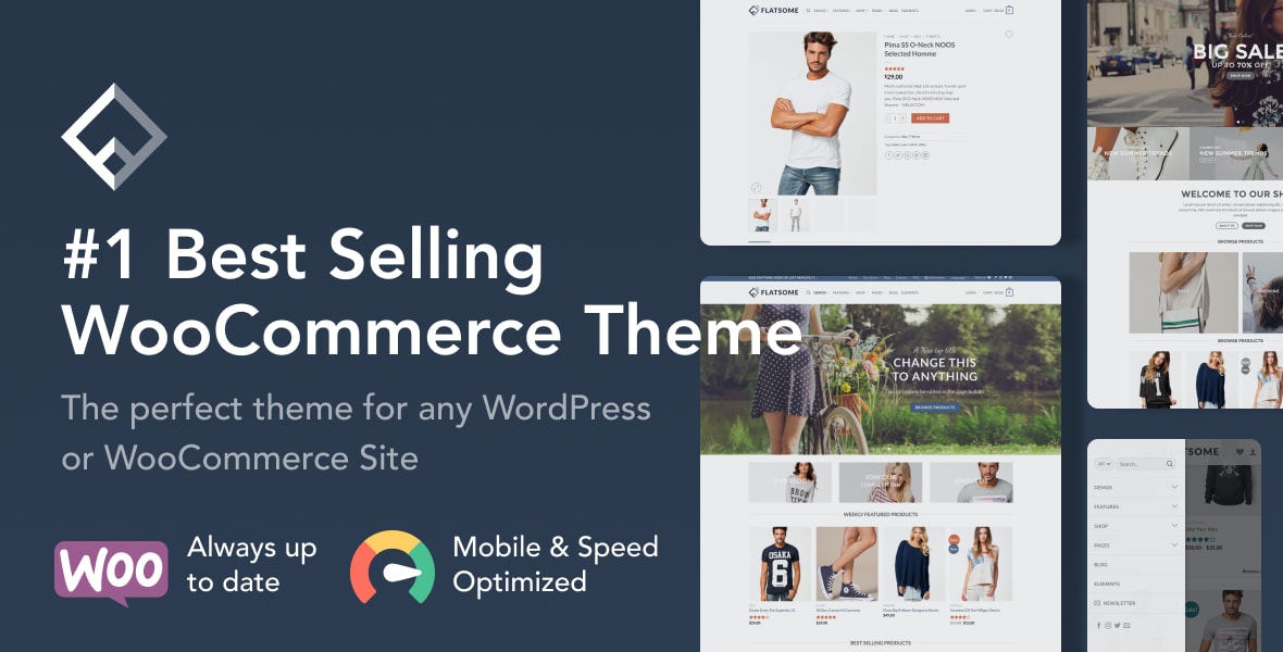
Flatsome | Multi-Purpose Responsive WooCommerce Theme
UX-themes · WooCommerce
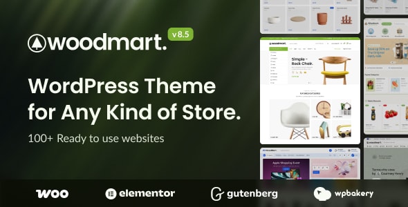
WoodMart - Multipurpose WooCommerce Theme
xtemos · WooCommerce
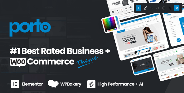
Porto - AI Powered WordPress Website & Shop Builder
p-themes · WooCommerce

uDesign | Multipurpose WordPress Theme
AndonDesign · Business
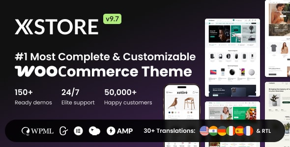
XStore | Multipurpose WooCommerce Theme
8theme · WooCommerce
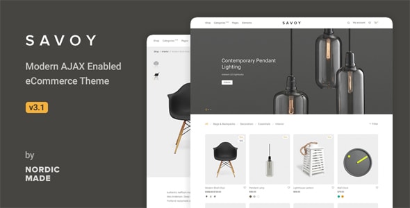
Savoy - Minimalist AJAX WooCommerce Theme
NordicMade · WooCommerce
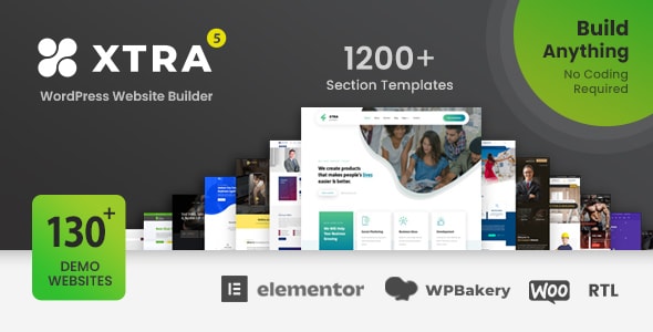
Xtra - Multipurpose WordPress & WooCommerce Theme + RTL
Codevz · Business
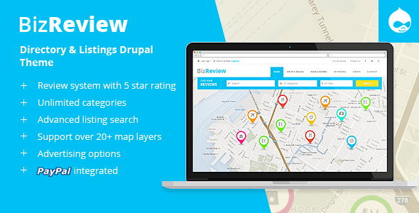
BizReview - Directory Listing Drupal 11 - 10 Theme
symphonythemes · Corporate
Buying guide
What Makes a WordPress Theme Truly Mobile-Ready?
Responsive design is now a baseline expectation — nearly every premium theme technically adapts to smaller screens. The real differentiators are the details: how intelligently headers collapse into mobile menus, whether product grids reflow cleanly at 375px, how quickly above-the-fold content loads on a 4G connection, and whether touch targets (buttons, sliders, add-to-cart elements) are sized for thumbs rather than mouse cursors.
When evaluating the themes on this hub, our editorial team assessed mobile-specific features including dedicated mobile header builders, sticky mobile navigation, swipe-gesture support, and the availability of lazy-loading for images. We also weighed buyer ratings and sales volume as a proxy for real-world satisfaction across a wide range of devices.
How to Choose the Right Mobile Theme for Your Site
Match the theme to your site type
If you're building a WooCommerce store, prioritize themes like Flatsome, WoodMart, and XStore, which invest heavily in mobile product pages, quick-view panels, and streamlined checkout flows. For broader multipurpose sites, Betheme and Porto offer wide template libraries that cover many niches, each with mobile-optimized layouts baked in.
Look beyond the demo previews
Demo previews are almost always shown at desktop width. Before purchasing, resize your browser window or use a device emulator to preview the live demo at mobile breakpoints. Check the mobile menu behavior, font legibility, and how images scale. Most themes on this hub provide live demos — use them.
Consider long-term update frequency
Mobile standards evolve — Core Web Vitals thresholds shift, new device screen ratios emerge, and browsers update rendering behavior. All themes reviewed here are actively maintained with strong sales histories, which correlates with continued developer support. Themes with lower sales or older last-update dates carry a higher risk of falling behind on mobile compatibility over time.
Trade-offs to Keep in Mind
- Feature richness vs. page weight: Multipurpose themes pack a lot in — that can mean more JavaScript and CSS to load on mobile. Disciplined plugin management and a caching layer are essential.
- Customization depth vs. complexity: Themes with the most mobile customization options (separate mobile headers, per-breakpoint font sizes) also tend to have steeper learning curves.
- High sales ≠ right fit: A 300,000-sale theme is proven, but it may be over-engineered for a simple five-page site. Match scope to need.
Use the theme cards below to compare editorial scores, buyer ratings, and key mobile features side by side before making your decision.
Frequently asked
Does a higher buyer rating mean better mobile performance?
Not exclusively. A high rating reflects overall satisfaction — support quality, feature breadth, value, and stability all factor in. That said, themes like WoodMart (4.91/5) and Porto (4.92/5) earn their scores across hundreds of real projects, which gives our team reasonable confidence that mobile usability is a consistent strength rather than a happy accident.
Are these themes compatible with Google's Core Web Vitals on mobile?
All six themes reviewed here are built with performance in mind, but Core Web Vitals scores depend heavily on your hosting, installed plugins, image sizes, and configuration — not the theme alone. A well-tuned install of any of these themes can pass Core Web Vitals; a poorly configured one can fail regardless of the theme.
Can I customize the mobile menu separately from the desktop header?
Several themes on this list — including Flatsome, WoodMart, and Porto — include dedicated mobile header builders or separate mobile navigation controls. This lets you simplify the mobile menu independently without touching your desktop layout. Check each theme's feature list for specifics, as the depth of control varies.
Do multipurpose themes perform as well on mobile as niche-specific themes?
They can, but it takes more configuration. Multipurpose themes ship with many demo templates, and not every template is equally optimized out of the box. Starting from a demo close to your intended use case — and removing unused page builder elements — will help you reach a leaner, faster mobile result.
Is $59–$60 a one-time cost, or will I pay again for updates?
On the major marketplaces where these themes are sold, the purchase price includes six months of support and lifetime theme updates. Extended support beyond six months is available for an additional fee. You will not typically pay the full purchase price again simply to receive updates.